The COVID undercount, May 16, United States: 32.8%.
Every morning, if you like, you can go to the Johns Hopkins dashboard and get the current count of COVID-19 cases and deaths in the United States. Neither is particularly reliable; we don't test everyone, so we don't know the real number of cases. And COVID-19 deaths are not reliable either. Here's why:
- At the beginning of the epidemic, in good faith we were failing to code deaths as COVID-19, because the disease was still mysterious at the time
- Very old people often don't show the canonical symptoms of COVID-19, and simply die unexpectedly. Unless you make an effort to test, you don't know COVID-19 was the cause
- And finally, some states' governors, all or mostly Republicans, are for political reasons miscoding COVID deaths as pneumonia
Fortunately there's a more reliable but slower alternative. All deaths in the US are recorded by the CDC as death registrations. These have cause of deaths as reported by the attending physician. And for any given week of the year, total US deaths are remarkably constant over periods of about half-a-decade. Tell me how many people died this corresponding week last year, or better yet over the last 5 years, and I can usually tell you to high accuracy (within 1%) deaths this year. Death rates decay slowly throughout the spring, but in a predictable way.
So in a severe epidemic, we can measure the death rate simply by subtracting actual deaths from expected deaths. It doesn't depend on diagnosis. It simply tells you how many more people died than expected.
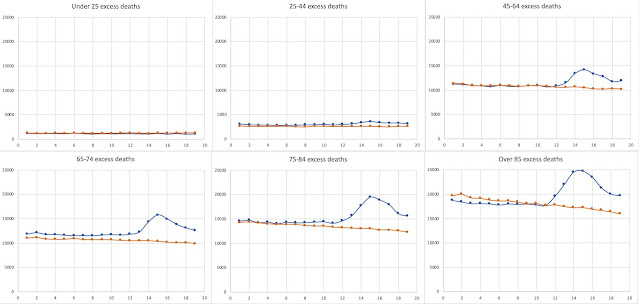
These are deaths for six age groups, averaged for each week over the last five years, compared with deaths this year.
As you can see, the expected deaths (orange) and deaths in 2020 (blue) follow each other closely for the first 10 weeks in the year.
(Parenthetically, I think the very slight mismatch in thr 65-74 age group is due to Vietnam, which killed 60,000 Americans, mostly male. In 2015-2016, the 65-74 group corresponded to those born in 1941-1951. The tail end of that group were draft age during the height of the war. Enough young men from that group were killed that there is a significantly higher percentage of women in that clade, with a correspondingly lower death rate. But, whatever...)
. But after week 10, there's a huge increase in 2020, primarily in the older age-groups. That is COVID. Under 25s don't show it; it's relatively huge for over-85s. I was interested that the risk for 25-45s was a bit higher than I thought it would be. Older than 25, you aren't safe.
Anyway, for the moment, none of that matters. We just add them all up, giving this:
...and we just integrate the difference between the two curves between Week 10 and week 19 (March 8 - May 16, inclusive), getting 124770 deaths. Problem is, when we look at the Johns Hopkins numbers, we get 82543. So Johns Hopkins is only recording 66.2% (almost exactly ⅔) of all excess deaths. Right now, where we have 117,717 deaths according to Johns Hopkins, the true number of excess deaths is better estimated at 178,000 deaths.
Now, you could argue that there might be other contributions to excess deaths -- untreated cancer, heart disease, etc.. But there's no evidence for any of that; it's mere speculation. In fact, the lockdown may well have reduced accidental and automobile deaths. In fact, excess deaths are the best estimate we have of COVID deaths, and the data quality looks excellent.
Tomorrow we'll dig down into the excess deaths, and try to see what else the data tell us.


Comments
Post a Comment